Compose Multiplatform Navigation Solutions - Appyx
Explore Voyager: Easy Navigation for Compose Multiplatform

In the upcoming posts, I will thoroughly explore several popular navigation libraries that are essential for effective app development. These libraries play a crucial role in managing app navigation, ensuring a smooth and intuitive user experience. In today's episode, we will focus on the Appyx library. We will examine how Appyx handles various navigation scenarios, its integration process.
Choosing a navigation library for your Compose Multiplatform project can be challenging. The decision requires careful consideration of your project's requirements and future scalability, understanding the strengths and limitations of each library is crucial to avoid potential pitfalls and ensure a seamless development process.
Showcase application assumptions:
Application should allow us to navigate from one screen to another.
Application should allow to pass some parameters from first to second screen.
Application should handle the screen rotation without loosing data.
Application should handle the Tab Navigation.
Application should handle the async operations with coroutines.
The project is available in the GitHub repository.
Dependencies
Base project setup, as always, is made with Kotlin Multiplatform Wizard. We also need to add Appyx as it is the core element we want to examine. Appyx consists of three main libraries that complement each other: navigation, interactions, and components. This allows us to create a fully customized application.
libs.versions.toml
[versions]
appyx = "2.0.1"

[libraries]
appyx-navigation = { module = "com.bumble.appyx:appyx-navigation", version.ref = "appyx" }
appyx-interactions = { module = "com.bumble.appyx:appyx-interactions", version.ref = "appyx" }
appyx-components-backstack = { module = "com.bumble.appyx:backstack", version.ref = "appyx" }
Freshly added dependencies need to be synced with the project and added to the build.gradle.kts.
sourceSets {
    commonMain.dependencies {
        ...
        implementation(libs.appyx.navigation)
        implementation(libs.appyx.interactions)
        api(libs.appyx.components.backstack)
    }
}
Appyx Introduction
With dependencies added, we can start to create the navigation. Following the Appyx documentation, we can notice one major thing: Appyx gives us flexibility in interpreting the term "navigation." Most modern libraries/solutions focus on how to get from one screen to another, but Appyx gives us the possibility to create navigation that is not only about screens but "viewport." It can be whatever you can imagine, for example, spinning the carousel.
Node
Nevertheless, we will focus on traditional Stack navigation. There are some basic blocks that we need to use. The first one is Node, which is a representation of the structure (in our case, the screen). Each node can hold other nodes, and they are called children. The node is a standalone unit with its own:
AppyxComponent - in our case, it will be a
back stack, with simple linear navigation. The element at the front is considered active, others are stashed. It can never be empty. It has some basic helper functions likepush,pop,replace, and a default back handler.Lifecycle - it's a multiplatform interface that notifies the component about the state changes on the platform. For example, on the Android platform, it is implemented with
AndroidLifecycle.State Restoration after orientation changes
View, which is created with
@ComposableBusiness logic
Plugins - since
Nodesshould be kept lean, the plugins are used to add additional functionality, for example,NodeLifecycleAwarethat allows listening to the lifecycle events.
The nodes can be as small as you want to keep the complexity of your logic low and encapsulated, and extracted to the children to compose the navigation process. With the nodes, your navigation can work as a tree with multiple branches responsible for different processes. Some parts of the tree are active - visible on the screen, while others are stashed. To change what's currently active, we will use the component; the change will look like navigation by adding or removing nodes.
Such an approach creates a Scoped DI, a situation where if the parent node is destroyed, all of its children nodes and related objects are released. There is also ChildAwareAPI that helps with communication between the parent and dynamically added child.
RootNode
After that short introduction it's time to code. First thing that we need to create is RootNode.
class RootNode(
    nodeContext: NodeContext,
) : LeafNode(nodeContext) {

    @Composable
    override fun Content(modifier: Modifier) {
        Column(
            modifier = Modifier.fillMaxSize().then(modifier),
            verticalArrangement = Arrangement.Center,
            horizontalAlignment = Alignment.CenterHorizontally
        ) {
            Text("Hello Appyx!")
        }
    }
}
Similarly, as in the Decompose library, we need to provide context. The NodeContext is created on the host platform (e.g., Android's MainActivity) and is passed down to all the descendants. It ensures the support of lifecycle and keeps the structured hierarchy of children nodes. The LeafNode uses the context to handle all the lifecycle events, manage plugins, provide the coroutines scope, and manage the children creation to keep the structured nodes hierarchy mentioned in scoped DI. It also forces us to implement a @Composable function Content that will be used to create the view.
Android
Let's connect the RootNode with the hosts. For Android, we need to use MainActivity and inherit from the NodeComponentActivity(), which integrates Android with Appyx under the hood (if you don't want to inherit from ready-made solutions, you can implement ActivityIntegrationPoint yourself). Then we need to create the NodeHost (which is responsible for providing nodeContext) and provide it with lifecycle.
class MainActivity : NodeComponentActivity() {
    override fun onCreate(savedInstanceState: Bundle?) {
        super.onCreate(savedInstanceState)

        setContent {
            MaterialTheme {
                NodeHost(
                    lifecycle = AndroidLifecycle(LocalLifecycleOwner.current.lifecycle),
                    integrationPoint = appyxIntegrationPoint
                ) { nodeContext ->
                    RootNode(nodeContext)
                }
            }
        }
    }
}
iOS
With the iOS we just need to create proper host the IosNodeHost with default IntegrationPoint as it is a @Compose function.
fun MainViewController() = ComposeUIViewController {
    IosNodeHost(
        modifier = Modifier,
        integrationPoint = MainIntegrationPoint(),
        onBackPressedEvents = backEvents.receiveAsFlow()
    ) { nodeContext ->
        RootNode(nodeContext)
    }
}
Linear Navigation
The basic setup was done, we were able to display initial screen with the text. Now we can add children screens. The screen definition need to be defined as Parcelable it will tell the node where we ant to go. The Parcelableis a part of Appyx library and it's expect/actual class so it has a common definition that is implemented differently on platforms. For android platform we need to add the support od kotlin-parcelizeplugin to use @Parcelize annotation.
plugins {
    ...
    id("kotlin-parcelize")
}
Now we can define some navigation targets to enhance our app's functionality. To do this, we need to specify the screens we want to navigate to. Each screen should be defined as a Parcelable object, which will inform the node about the destination.
sealed class NavTarget : Parcelable {
    @Parcelize
    data object FirstScreen : NavTarget()

    @Parcelize
    data object SecondScreen : NavTarget()
}
Targets are defined, so now the RootNode needs to be modified to handle the BackStackcomponent and provide a way to navigate between different screens. The first change we need to make is to transform the RootNode from being merely a LeafNode to a Node<>. A LeafNode is a simple node that cannot have children and is primarily used to display static content. On the other hand, a Node<> is more versatile as it can have child nodes and is capable of managing navigation between them.
To achieve this, we need to update the RootNode class to include the BackStackcomponent, which will keep track of the navigation history. This allows the app to handle back navigation correctly and ensures that users can move seamlessly between different screens.
The Node requires the NavTarget to be defined and the buildChildNode function to be implemented. These two elements are crucial because they handle the creation and management of the child nodes. The NavTarget serves as a blueprint for the different screens or destinations within the app, while the buildChildNode function is responsible for constructing these child nodes whenever navigation occurs.
Additionally, another important aspect to consider is the appyxComponent parameter. This parameter plays a significant role in defining how the nodes will be managed and navigated. It determines the behavior and lifecycle of the nodes, ensuring that they are correctly instantiated, displayed, and disposed of as the user navigates through the app.
private fun backstack(nodeContext: NodeContext): BackStack<NavTarget> = BackStack(
    model = BackStackModel(
        initialTarget = NavTarget.FirstScreen,
        savedStateMap = nodeContext.savedStateMap,
    ),
    visualisation = { BackStackFader(it) }
)
The destination nodes may look like the following:
class FirstNode(
    nodeContext: NodeContext
) : LeafNode(nodeContext = nodeContext) {
    @Composable
    override fun Content(modifier: Modifier) {
        Column(
            modifier = Modifier.fillMaxSize(),
            verticalArrangement = Arrangement.Center,
            horizontalAlignment = Alignment.CenterHorizontally
        ) {
            Text("Hello from the First Node!")
        }
    }
}
To enable navigation between different screens, we will add simple lambda expressions. These lambda expressions will be invoked within the child nodes, but the actual handling will occur in the root node. This approach allows us to centralize the navigation logic, making it easier to manage and maintain.
class FirstNode(
    private val onButtonClick: () -> Unit
) : LeafNode(nodeContext = nodeContext) {
    @Composable
    override fun Content(modifier: Modifier) {
        ...
        TextButton(onClick = onButtonClick) {
            Text("Go to Second Node")
        }
    }
}
class RootNode(
    nodeContext: NodeContext,
    private val backstack: BackStack<NavTarget> = backstack(nodeContext),
) : Node<NavTarget>(
    appyxComponent = backstack,
    nodeContext = nodeContext,
) {
    override fun buildChildNode(navTarget: NavTarget, nodeContext: NodeContext): Node<*> =
        when (navTarget) {
            NavTarget.FirstScreen -> FirstNode(nodeContext) {
                backstack.push(NavTarget.SecondScreen)
            }
            NavTarget.SecondScreen -> SecondNode(nodeContext) {
                backstack.push(NavTarget.FirstScreen)
            }
        }
}
The last step involves adding the AppyxNavigationContainer. This container is crucial as it will manage the navigation and render the content of the nodes that we have added.
@Composable
override fun Content(modifier: Modifier) {
    AppyxNavigationContainer(appyxComponent = backstack)
}
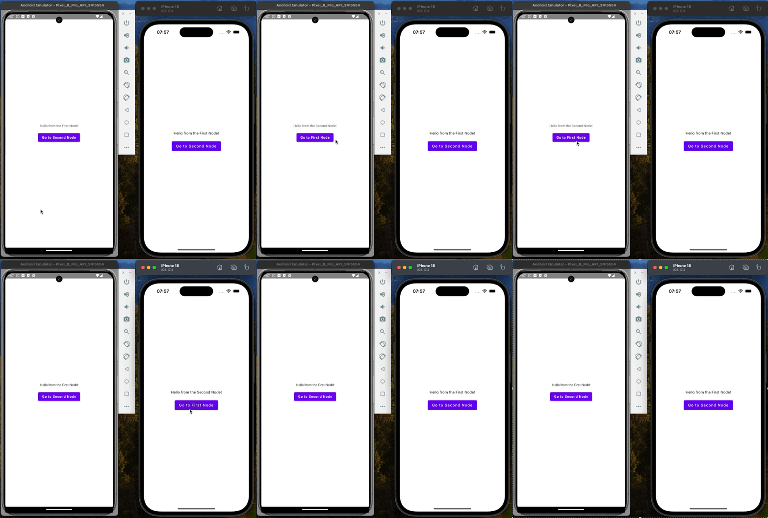
You can experiment with different visualisations, for example BackStackFader, BackStackSlider, BackStackParallaxor other mentioned in the documentation
Tab Navigation
To handle the bottom navigation feature, we need to use a Spotlightcomponent. This component functions similarly to an Android view pager, allowing us to manage multiple nodes simultaneously while keeping one of them active and visible at any given time. The Spotlight component is designed to facilitate smooth transitions and intuitive navigation within the app.
The principle is the same as with linear navigation, where we use a backstack to manage the navigation flow. However, for bottom navigation, we switch from using backstack to spotlight. This switch enables us to handle multiple nodes more efficiently and provides a better user experience by maintaining the state of each node while navigating between them.
Spotlight
To implement this, we first need to define the nodes that will be part of the bottom navigation. Each node represents a different screen or feature within the app. Once the nodes are defined, we can use the Spotlight component to manage their visibility and transitions. Additionally, the Spotlight component offers various customization options, such as animations and transition effects, to enhance the user experience.
appyx-components-spotlingh = { module = "com.bumble.appyx:spotlight", version.ref = "appyx" }
Let's create new navigation targets for tabbed navigation.
sealed class SpotlightNavTarget : Parcelable {
    @Parcelize
    data object ThirdScreen : SpotlightNavTarget()

    @Parcelize
    data object FourthScreen : SpotlightNavTarget()
}
Now we need to create a parent node that will hold the spotlight component.
class SpotlightNode(
    nodeContext: NodeContext,
    private val model: SpotlightModel<SpotlightNavTarget> = spotlightModel(nodeContext),
    private val spotlight: Spotlight<SpotlightNavTarget> = Spotlight(
        model = model,
        visualisation = { SpotlightSlider(it, model.currentState) }
    ),
) : Node<SpotlightNavTarget>(
    appyxComponent = spotlight,
    nodeContext = nodeContext,
)
We have to provide SpotlightModel and SpotlightVisualisation. One will handle navigation, and the other will handle the animation. The model takes a list of elements available to be displayed in the carousel and the initial index of the default active tab.
private fun spotlightModel(nodeContext: NodeContext) = SpotlightModel(
    items = listOf(SpotlightNavTarget.ThirdScreen, SpotlightNavTarget.FourthScreen),
    initialActiveIndex = 0f,
    savedStateMap = nodeContext.savedStateMap
)
Last thing to do is to create a UI representation of the screen, we will use Scaffold and default button
@Composable
override fun Content(modifier: Modifier) {
    Scaffold(
        bottomBar = {
            Row(Modifier.background(Color.White)) {
                TextButton(modifier = Modifier.weight(1f), onClick = { spotlight.first() }) {
                    Text(text = "Third")
                }
                TextButton(modifier = Modifier.weight(1f), onClick = { spotlight.last() }) {
                    Text(text = "Fourth")
                }
            }
        }
    ) { paddings ->
        AppyxNavigationContainer(modifier = Modifier.padding(paddings), appyxComponent = spotlight)
    }
}
The targets nodes will be exactly the same but with a different text and a background.
class ThirdNode(
    nodeContext: NodeContext,
) : LeafNode(nodeContext = nodeContext) {
    @Composable
    override fun Content(modifier: Modifier) {
        Column(
            modifier = Modifier.fillMaxSize().background(Color.Magenta),
            verticalArrangement = Arrangement.Center,
            horizontalAlignment = Alignment.CenterHorizontally
        ) {
            Text("Hello from the Third Node!")
        }
    }
}
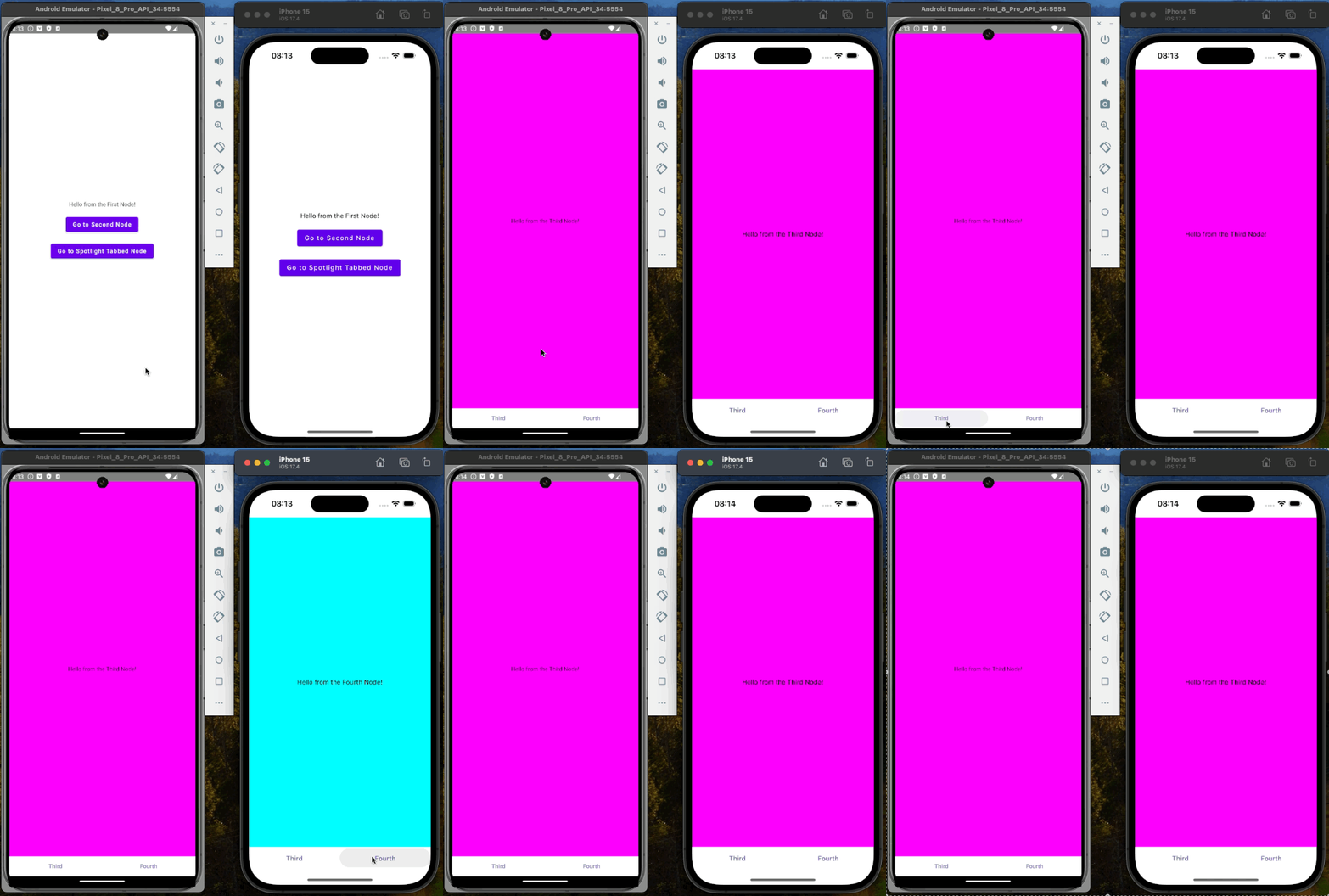
The solution is ready to use, as it was designed to work just out of the box. We need to add only the entry point to our existing navigation. We need to add TabScreen as a NavTarget in the linear navigation and a button in FirstNode that will run the tabbed navigation feature.
Material3 Support
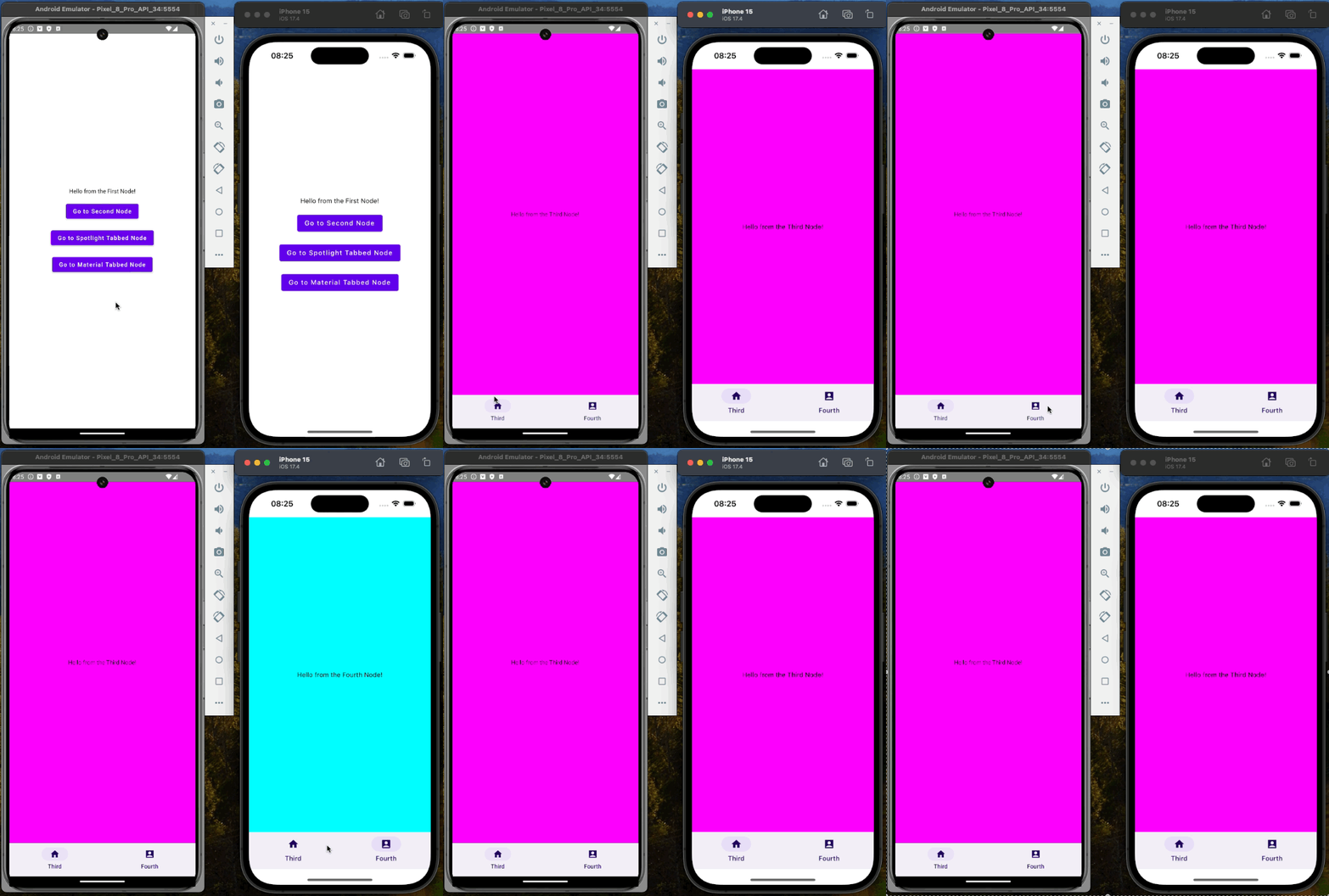
Appyx also provides Material3 support with an out-of-the-box solution for bottom navigation, allowing developers to create a seamless and visually appealing navigation experience using built-in components. The material support library leverages the spotlight component under the hood, which is a powerful tool for managing navigation transitions and animations. To utilize this feature, we need to add another dependency to the project. This additional dependency ensures that the spotlight component is available, enabling smooth integration and functionality of the bottom navigation within our application. By incorporating Material3 support, we can enhance the user interface and provide a more cohesive and modern look and feel to our app's navigation system.
appyx-utils-material = { module = "com.bumble.appyx:utils-material3", version.ref = "appyx" }
commonMain.dependencies {
    ...
    api(libs.appyx.utils.material)
}
After syncing the project, we will reach the AppyxNavItem, which will be used in bottom navigation, and the AppyxMaterial3NavNode, responsible for navigation. The creation of the TabNavigationItems is straightforward and similar to the previously used linear navigation. We need to create destinations; in our case, these will be the enums that represent the screens/nodes.
@Parcelize
enum class TabNavigationItems : Parcelable {
    FIRST_DESTINATION, SECOND_DESTINATION;
}
Now we can create the resolver that will be responsible for creating the bottom bar. It takes the defined destination and creates the proper navigation items, with text, icons, and a lambda that will create the desired nodes.
companion object {
    val resolver: (TabNavigationItems) -> AppyxNavItem = { navBarItem ->
        when (navBarItem) {
            FIRST_DESTINATION -> AppyxNavItem(
                text = "Third",
                unselectedIcon = Icons.Sharp.Home,
                selectedIcon = Icons.Filled.Home,
                node = { ThirdNode(it) }
            )

            SECOND_DESTINATION -> AppyxNavItem(
                text = "Fourth",
                unselectedIcon = Icons.Sharp.AccountBox,
                selectedIcon = Icons.Filled.AccountBox,
                node = { FourthNode(it) }
            )
        }
    }
}
The last thing to do is to create proper starting node.
class TabNode(
    nodeContext: NodeContext,
) : AppyxMaterial3NavNode<TabNavigationItems>(
    nodeContext = nodeContext,
    navTargets = TabNavigationItems.entries,
    navTargetResolver = TabNavigationItems.resolver,
    initialActiveElement = TabNavigationItems.FIRST_DESTINATION,
)
Coroutines
There is no official approach on how to handle coroutines inside the Nodes, but there are several strategies we can employ. One common method is to utilize the NodeLifecycle, which provides both the lifecycle and lifecycleScope. This allows us to manage coroutines effectively within the node's lifecycle, as shown in the example.
The Decompose (which I mentioned in a previous post) provides us with default support for coroutines inside the library core elements - Component.
Additionally, we can leverage the lifecycle to add an observer using PlatformLifecycleEventObserver. This observer can be used to create and manage a coroutineScope, ensuring that coroutines are properly handled throughout the node's lifecycle events.
Another option is to use the scope provided by the @Composable view with rememberCoroutineScope(). This approach ties the coroutine scope to the composable's lifecycle, making it a convenient choice for managing coroutines within composable functions.
Moreover, we can mix these approaches to suit different needs and scenarios. For instance, we might use NodeLifecycle for some coroutines and rememberCoroutineScope() for others, depending on the specific requirements of our application. By combining these strategies, we can achieve a robust and flexible coroutine management system within our nodes.
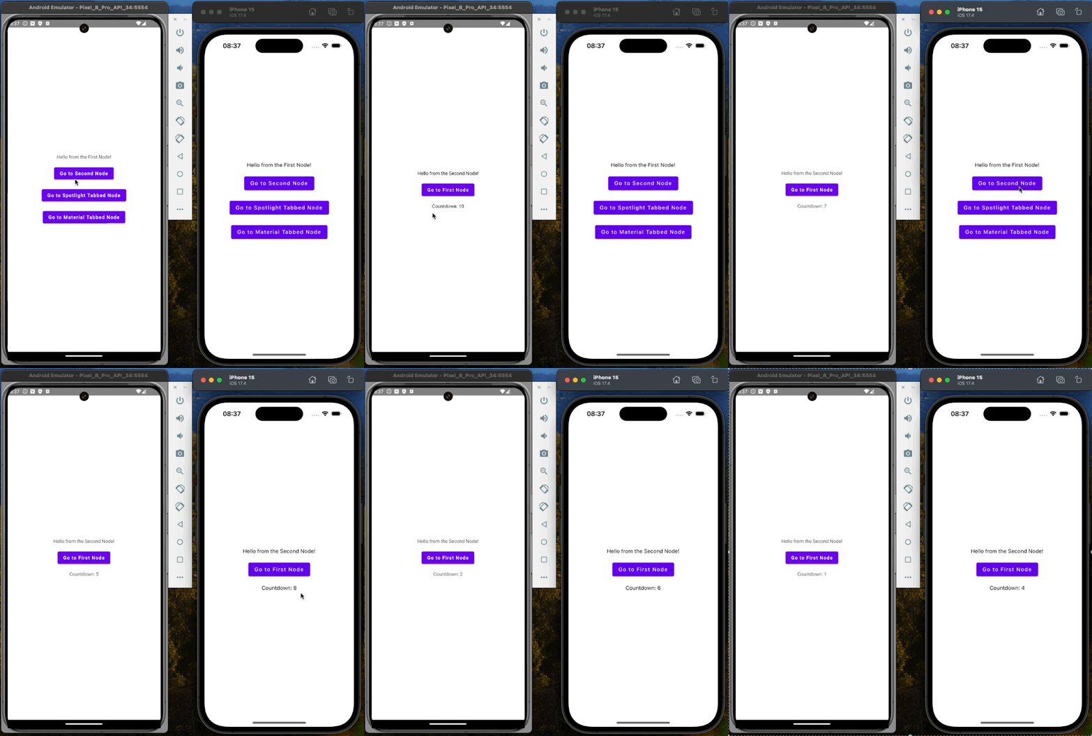
Moving further I will extend the SecondNode with a countdown timer that will be started on the screen creation and update the text value.
    private val countDownText = mutableStateOf<String>("0")

init {
    lifecycle.coroutineScope.launch {
        for (i in 10 downTo 0) {
            countDownText.value = i.toString()
            delay(1000)
        }
    }
}
@Composable
override fun Content(modifier: Modifier) {
    Column(...) {
        ...
        Spacer(modifier = Modifier.height(16.dp))
        Text("Countdown: ${countDownText.value}")
    }
}
You should consider finding a more suitable place to hold your business logic than the Node. Ideally, this place should be capable of handling configuration changes and recreating the view while retaining the state. The ViewModel is an excellent choice for this purpose, as it is specifically designed to manage UI-related data in a lifecycle-conscious way. However, it's important to note that ViewModel is not currently a part of the Appyx library, so you will need to implement it yourself.
Appyx is actively working on adding ViewModel support, and you can express your interest and vote for this feature here. This will help prioritize its development and integration into the library.
In the meantime, if you need to ensure that your application survives configuration changes, there is an official guide available. This guide provides detailed instructions and best practices for managing configuration changes effectively. By following this guide, you can ensure that your app remains robust and maintains its state across various configuration changes.
Summary
The Appyx library is a powerful tool that allows you to create fully customized navigation in your Compose Multiplatform application. It's a great solution for creating complex navigation structures, and it's easy to use. The library is tightly coupled with Jetpack Compose but doesn't provide a dedicated component to hold your business logic, so you are free to use your own solutions. The library is still in the development phase, waiting for ViewModel support as mentioned in the post. Therefore, it doesn't provide out-of-the-box support for coroutines. You need to handle it yourself, but it's not a big deal.
I hope this post has given you a good overview of the Appyx library and how you can use it to create navigation in your Compose Multiplatform application. If you have any questions or comments, please feel free to leave them below. I'd love to hear from you!
In this post, we'll explore the Appyx library for Compose Multiplatform, covering its integration, navigation capabilities, and support for various scenarios such as linear navigation, tab navigation, and asynchronous operations with coroutines. We'll walk through setting up dependencies, creating nodes, managing navigation, and handling coroutines. Additionally, we'll touch upon Appyx's flexibility for custom navigation solutions and its ongoing development for enhanced features like ViewModel support. This guide aims to provide a comprehensive understanding of utilizing Appyx for robust app navigation.
